Client:
Gartec
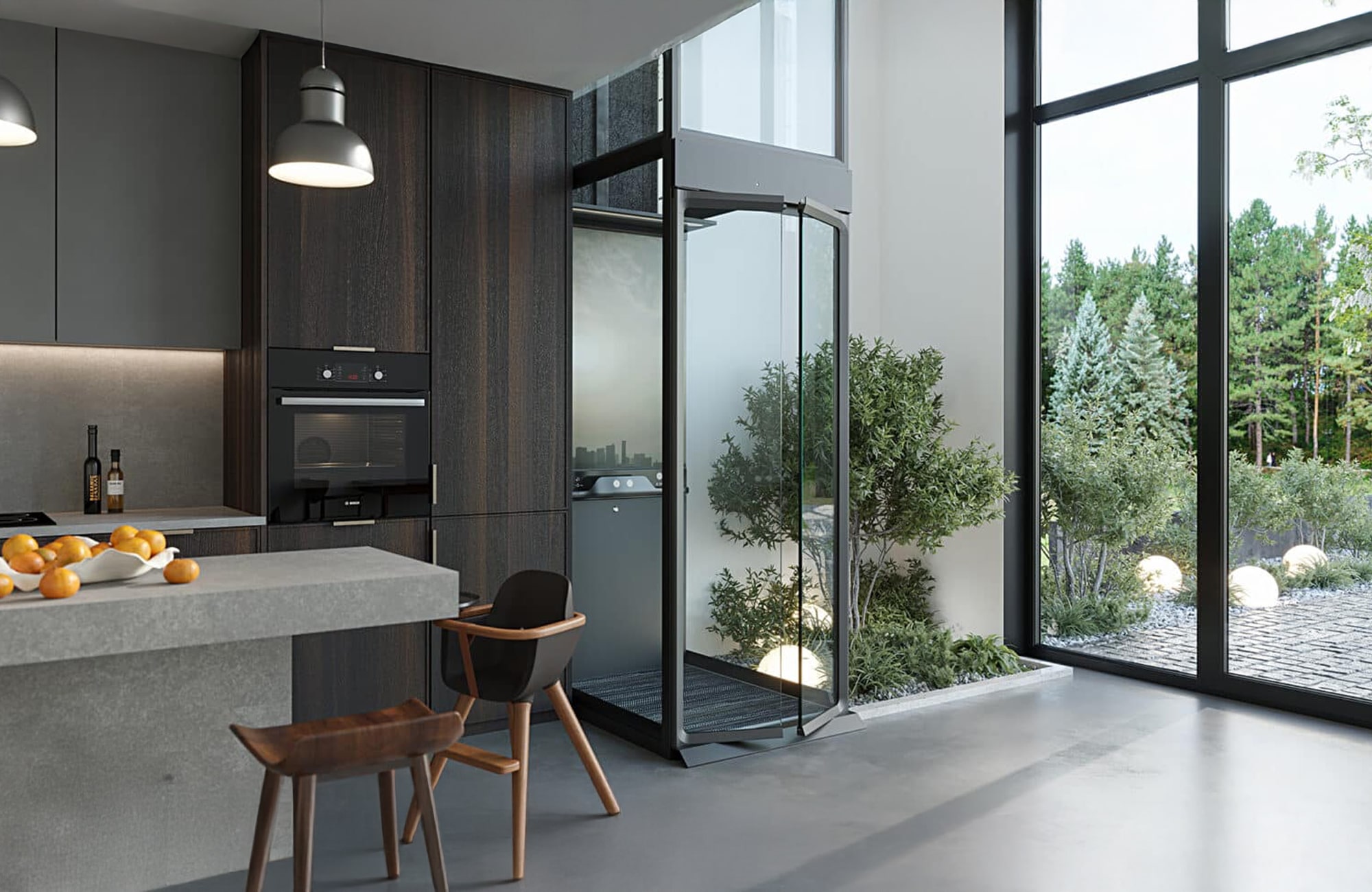
Gartec are the UK’s leading supplier and installer of platform lifts for public, commercial and home use.
They had recently launched new websites for both their Home and Commercial platforms, but they weren’t happy with the final builds. They came to us for help transforming their cramped and cluttered designs into something cleaner and more elegant. Having just created and populated two new sites from scratch, Gartec didn’t want to start a whole new build, so we decided to create a new design which could be applied to their existing site structure and content.
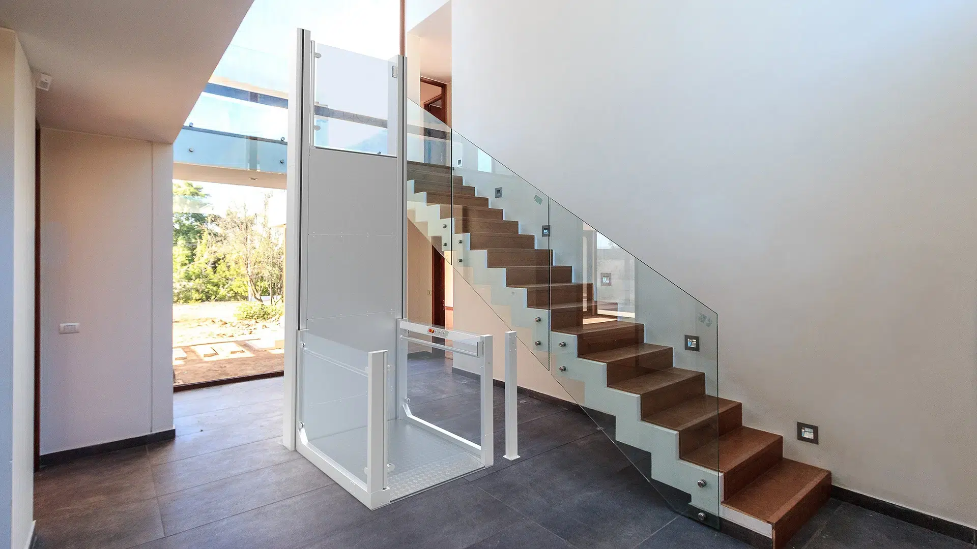
Our design and development team always start with research: we talked to Gartec about what they liked about the site and what they didn’t, what the main goals of the website are, and reviewed the UX of the current design. Armed with this information, our designer set out to improve the design – not just to make it more visually pleasing, but to improve the UX and CTR.
As the design felt cluttered, we created more white space. White space is important in improving the usability of a website – it separates the content, it makes the important things stand out, and it creates balance, as well as giving a design a feeling of elegance. This is important especially around call to action buttons- VWO’s report stated a 232% increase in conversion rate by reducing clutter around the CTA button.
In addition to creating more space around the CTA buttons, we reviewed their placement. We added a button to the above-the-fold banner on the homepage, directing customers to Gartec’s main goal: contact. We also reviewed the button colours, and decided to switch the main button colour to the brand Navy Blue – which stood out more clearly.
Once the design was completed, our development team set to work creating a new WordPress theme which could be swapped seamlessly with the current one. In addition to amending the styles, we reviewed the technical SEO of the site, making improvements to page structure, heading hierarchy and the accessibility of the site as we went.
